Color Coordination 2026: Outfit Palettes That Always Work
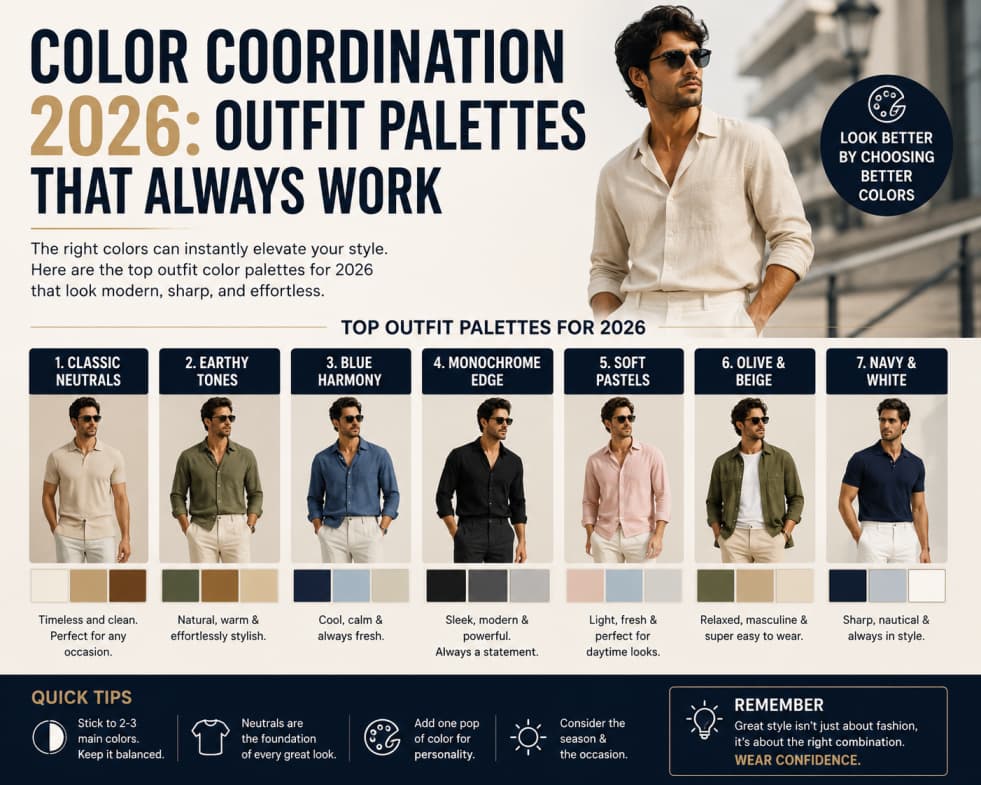
Color can feel intimidating, but most great outfits follow simple rules: one dominant neutral, one supporting tone, and one accent—or all neutrals with texture doing the work.
Start with neutrals you actually wear
Black, navy, gray, cream, and camel mix differently on each person. Hold fabrics near your face in daylight to see whether warm or cool tones look healthier. Build your closet around that discovery.
The 60-30-10 rule
Roughly sixty percent dominant color, thirty percent secondary, ten percent accent. A navy suit, light blue shirt, and burgundy tie follows the idea. Casual outfits can use denim as dominant, white tee as secondary, red bag as accent.
Monochrome without boredom
All-gray outfits need texture contrast—wool coat, cotton tee, leather boots. Slight shade differences add depth. Monochrome lengthens the silhouette when colors are close in value.
Complementary accents
Blue and orange, green and red appear on the color wheel as opposites. Use one as a small accent, not head-to-toe, unless you want bold fashion statements.
Seasonal palette shifts
Spring and summer invite lighter neutrals and pastels. Autumn and winter support deeper jewel tones and layering. Rotate accessories instead of replacing entire wardrobes.
Common mistakes
Too many competing brights, matching bag and shoes to every stripe, and ignoring metal tones in jewelry versus hardware on bags. Pick warm or cool metals and repeat.
Takeaway
Neutrals plus one accent is the fastest path to polished outfits. Add prints only after solids feel easy.